Common mistakes when labeling a business and how to avoid them
The lettering is one of the first elements that customers perceive when approaching a business.
“There is no second chance to make a good first impression.”
The lettering is one of the first elements that customers perceive when approaching a business. In many cases, even before entering, the image that a sign conveys directly influences the decision to stop, look or move on. A well-thought-out design and professional installation can make the difference between attracting attention and conveying confidence, or going unnoticed and generating a negative perception.
Many of the most common labeling errors are caused by a lack of planning, choosing quick solutions or not having specialized advice. Next, we review some of the most common mistakes when labeling a business and how to avoid them to achieve a neat, coherent and effective image.
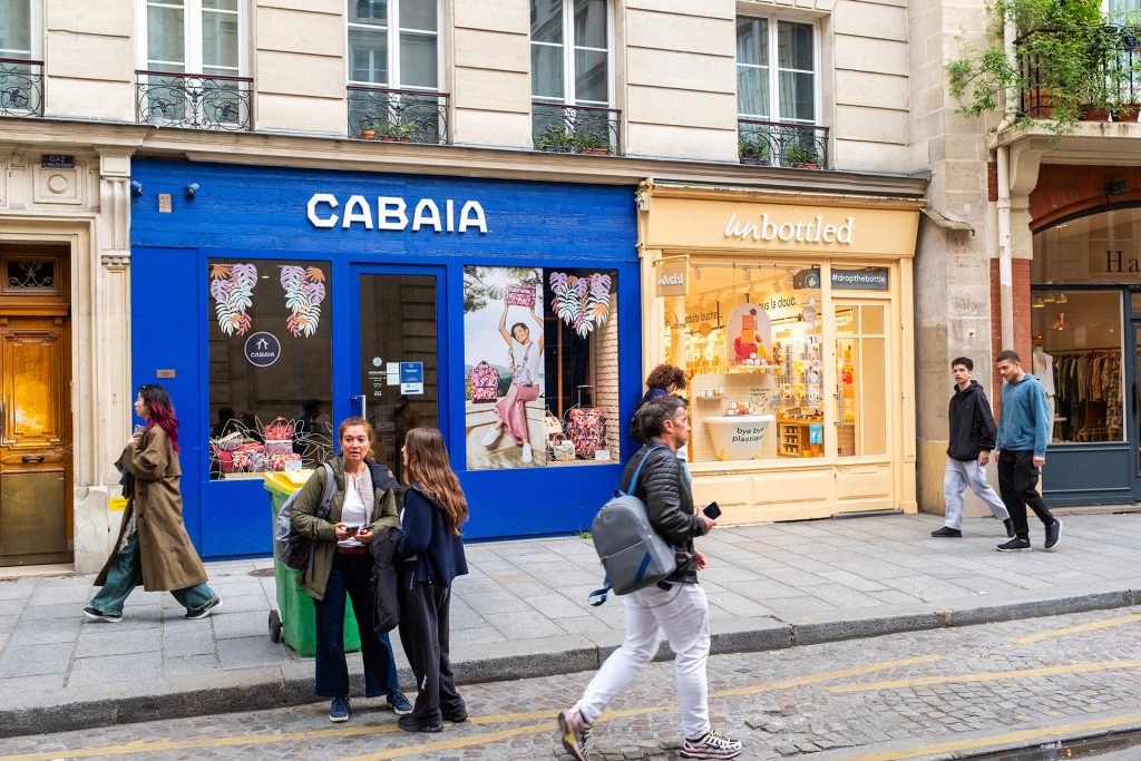
1. Choose a poorly legible design
One of the most frequent mistakes is opting for overloaded designs or with hard-to-read fonts. The use of colors with little contrast, excessively small texts or the accumulation of too much information make the message difficult to understand at a glance.
Effective signage must communicate clearly and directly. The customer must be able to read and understand the label in a few seconds and from the appropriate distance. In this case, less is more: a clean and tidy design always works better.
2. Not adapting the signage to the environment
Not all locations require the same type of sign. A design that works in a wide and clear street may not be suitable in a narrow environment or with a lot of visual competition around.
It is essential to take into account factors such as lighting, viewing angle, reading distance and the urban environment to adapt the format, colors and size of the signage. Analyzing the space before designing avoids mistakes and guarantees a better visual impact.
3. Use inappropriate materials
Choosing materials without taking into account the surface or the conditions of use is another common mistake. Not all vinyls, canvases or rigid supports offer the same resistance to the sun, rain, wind or daily wear and tear.
Using inappropriate materials can cause the lettering to lose color, deteriorate quickly or peel off, directly affecting the image of the business. Opting for quality and suitable materials for each project is key to ensuring long-term durability and good appearance.
4. Prioritize price over quality
Opting only for the most economical option usually has medium and long-term consequences. Low-quality lettering may require constant repairs, frequent replacements or convey an unprofessional image.
Investing in professional lettering is not an expense, but an investment in visibility, brand image and peace of mind. A well-executed label accompanies the business for years.
5. Neglect the installation
A good design or a quality print loses all its value if the installation is not done correctly. Bubbles, wrinkles, misalignments or poorly executed ends are visible errors that reduce professionalism and credibility.
The installation must be carried out by experienced professionals, who take care of every detail and guarantee a clean, safe and durable finish.
6. Not respecting the corporate identity
Modifying colors, fonts or proportions of the logo may seem like an unimportant detail, but it directly affects brand recognition. Visual inconsistency generates confusion and weakens the corporate image.
A sign aligned with the brand identity reinforces the positioning of the business and conveys confidence and professionalism to the client.
📍 Visit us at: www.grafiksestudio.com
Request your quote today!