EXPLORING CORPORATE TYPOGRAPHY TRENDS
EXPLORING CORPORATE TYPOGRAPHY TRENDS
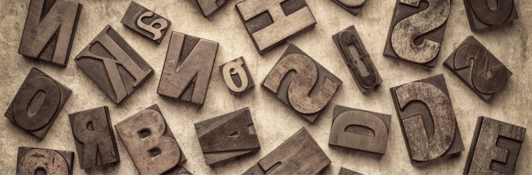
What do we mean by corporate typography ?
In the world of corporate design, every detail counts when it comes to transmitting a company’s identity. Typography, in particular, plays a key role in establishing the personality and perception of a brand. At Grafiks, as a sign and vinyl company, we understand the importance of an impactful and updated typography to stand out in a competitive market. In this article, we explore the latest trends in corporate typography that can elevate your company’s visual presence.
Elegant minimalism
Simplicity has always been powerful in design, and in the realm of corporate typography, minimalism is on the rise. Clean, geometric fonts offer a sleek, contemporary aesthetic. Every stroke, every line, and every white space become strategic elements to communicate the essence of your company in a subtle but impactful way. This approach is not only limited to font selection, but also extends to practical application in sign and vinyl projects. Imagine the facade of your company adorned with a minimalist typography that conveys confidence and modernity at first glance. At Grafiks, we help you select typefaces that reflect the essence of your company in a sophisticated and modern way.
Versatility Serif-Sans Serif
The combination of serif and sans serif fonts continues to be a popular trend. Serif fonts, with their elegant finials and details, add a touch of sophistication and tradition, while sans serif fonts, with their clean, modern style, add a contemporary and accessible touch. This strategic combination not only reinforces the professionalism of your brand, but also makes information easier to read and understand in various formats.It is important to note that the choice of serif and sans serif fonts may vary depending on the context and purpose of the design. For example, in large print documents, serifs can improve legibility, while in digital media, sans serifs tend to offer greater clarity on screens. Grafiks specializes in finding the perfect combination that fits your unique brand identity, ensuring consistency and legibility in all your visual applications.
Typographic Personalization
Customization is key to stand out in a saturated market. Every nuance and every white space is carefully considered to create a visual representation consistent with your company’s identity. This not only strengthens coherence in your corporate image, but also establishes a deeper connection with your audience, conveying authenticity and uniqueness. Every company has a story to tell, and custom typography becomes the voice that visually describes it. Working closely with you, we care about the essence of your brand, identifying key elements that can be translated into meaningful topographical details. In an ever-changing market, the flexibility and adaptability of the custom typography we offer at Grafiks allows you to stay on trend. At Grafiks, we not only offer a wide range of standard fonts, but also customization options that allow you to adapt the typography to your company’s specific values and personality.

Mix of styles
The combination of different typographic styles is a trend that continues to gain ground. At Grafiks, we encourage you to explore merging bold fonts with more subtle ones to create a striking visual contrast. By merging fonts, we create compositions that are not only aesthetically appealing, but also convey your message clearly and effectively. Style Mix is not only about creating visual contrasts, but also about selecting fonts that align with your brand’s personality.. One of the key advantages of typefusion is its adaptability. The fusion of styles should be a tool that enhances, not hinders understanding. Whether it’s exterior signage, decorative vinyl or promotional materials, Grafiks ensures that the combination of styles is consistent and effective across all visual communication channels. This ensures that your brand stands out consistently, regardless of the medium in which it is presented.
Kinetic Typography
In a digital world in constant motion, kinetic typography has become a creative and essential tool to capture the viewer’s attention. Kinetic typography not only adds dynamism to your messages, but also creates an engaging visual experience that stands out in an information-saturated environment. This technique reflects the modernity and innovation associated with your company. Grafiks offers you innovative solutions to incorporate movement to your typographic elements in your signage and vinyl applications, generating a unique and attractive visual impact. Imagine how your corporate messages come to life with elegant typographic animations that reinforce your brand identity. From illuminated signs to animated vinyls, kinetic typography can completely transform the perception of your company.

At Grafiks de Rotulación y Vinilados, we understand that typography is not only an aesthetic choice, but a strategic tool to communicate the essence of your company. Whether you opt for the elegance of minimalism, the versatility of combining serif and sans serif, the unique personalization, the audacity of the mix of styles, or the dynamic kinetic typography, at Grafiks de Rotulación y Vinilados we are here to materialize your most creative visions. By staying on top of current trends, we can offer you typographic design solutions that will help you stand out and leave a lasting impression on your customers. Let us enhance your visual identity and take your brand to the next level with our signage and vinyl solutions!